
40-PAGE E-BOOK

COLOR MIXING RECIPES FOR MOODY LANDSCAPES
You know that feeling when a painting just clicks — when the colors feel completely right, like they grew from the same place? That's what a limited palette does. And that's what this guide is about.
What is this?
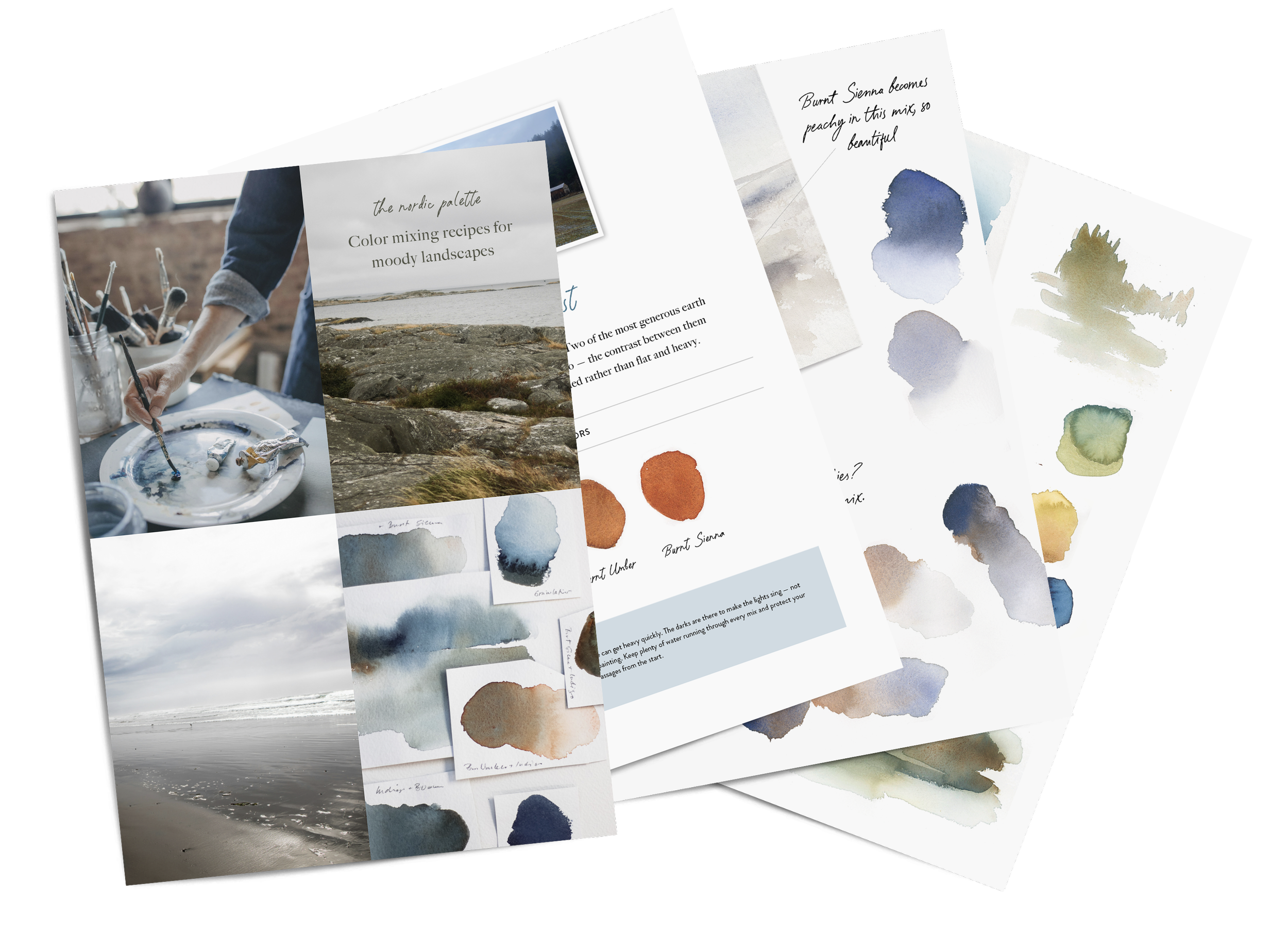
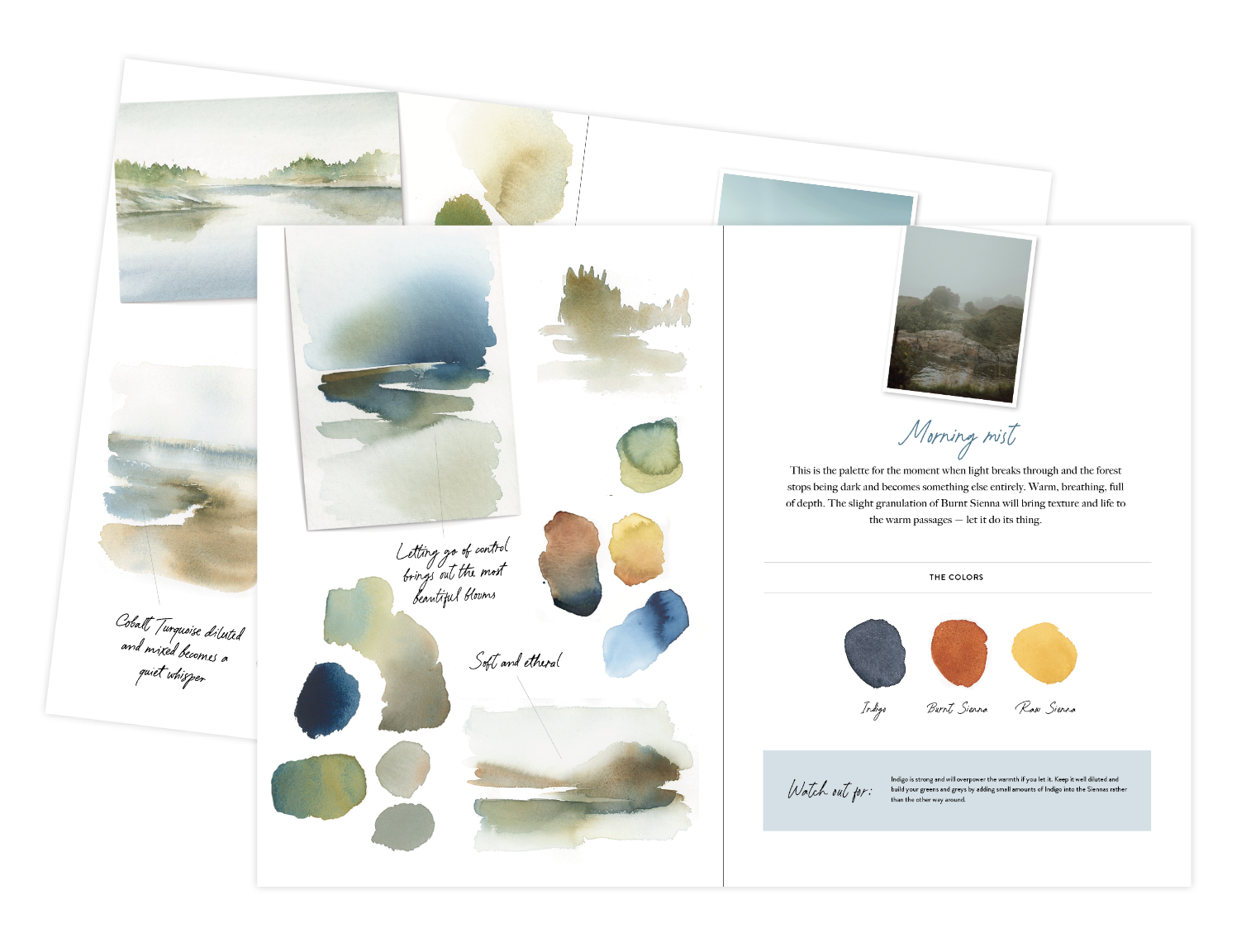
A 40-page watercolor guide built around 14 limited palette recipes, each one inspired by the Nordic landscapes I know by heart. Misty coastlines, autumn forests, winter archipelagos, pale spring light. Every palette uses three or four colors, no more, and every one of them comes straight from my own painting practice.
This isn't a theory book. It's a desk guide. Something you open, mix from, and paint with.
What’s inside
Digital PDF download (40 pages)
A deep dive into limited palette work — why fewer colors create more harmony, how to mix your own greys and greens, and why the colors you already have are enough.
An introduction to each color in the main palette — how it behaves, what it's good for, and what to watch out for.
Value and mixing charts to fill in yourself
14 color recipes with key mixes, mixing notes and tips.
Everything you need to go straight to your desk and paint.
I get asked about my colors constantly, this guide is my answer. Not just the names, but the why and the how. The mixes I return to again and again, and what I've learned from working with a small, considered palette for years.
$37 | Instant digital download
Frequently asked questions
-
No, this is a downloadable PDF guide. 40 pages you can read on screen or print out and keep at your desk while you paint.
-
Yes. You don't need any prior experience with color mixing to use this guide. If you can pick up a brush, you can work with this.
-
English
-
No, this is a color mixing guide rather than a painting course. It gives you the palettes, the mixes and the knowledge to take straight to your own paintings.
-
Due to the nature of digital downloads, I'm unable to offer refunds. If you have questions about whether this is right for you before purchasing, feel free to email me at hello@mariawigge.com
-
All recipes in this guide are based on Winsor & Newton watercolors. If you're working with a different brand the mixes may look slightly different, as shades can vary between manufacturers. The core palette is built around blues and earth tones, with a few additional colors appearing in specific recipes. You don't need everything to get started — most recipes use just three or four pigments and many share the same colors.